
Like, I suspect, most pen and ink artists, I’m always interested in new and interesting inks. And I just found some on Etsy that I tried out yesterday and will be using from now on to supplement the various, more standard black inks I use. NOTE: the seller specifically states that these water-based walnut inks are NOT SUITABLE FOR FOUNTAIN PENS, so use them with dip pens, a feather or reed quill or a brush only.
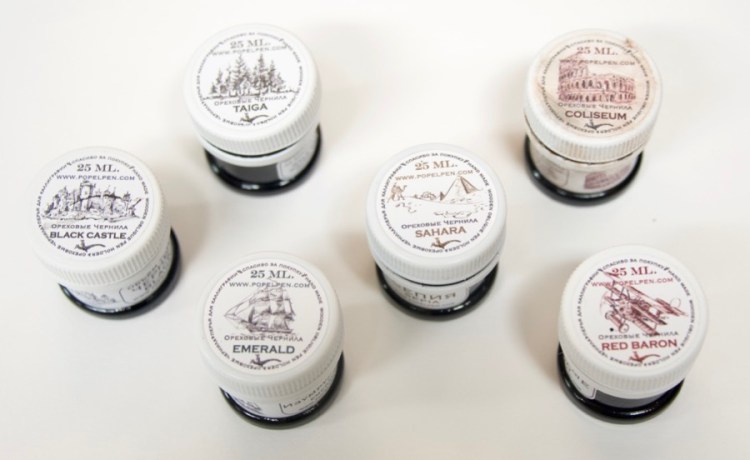
There are six different inks. They can be purchased separately or as a set, as I did. The full set is $9.99 plus shipping from Moscow, free with a purchase of $35 or more which, if you like trying out pen nibs, isn’t hard to ring up. The seller, Alexandre Popel (Bukvawood is the name of his Etsy shop) describes them as “…water-based walnut ink. Consistency, as in standard nut ink, which is obtained by diluting the crystals in distilled water.”
He doesn’t say what is used to create the various colors. But…wow…
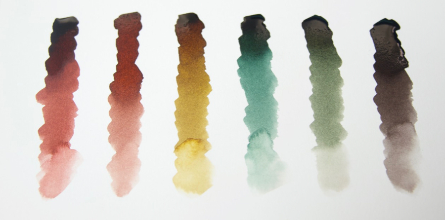
I’ll be testing them for lightfastness and other characteristics for a future post, but have tried them all out to see how they work for drawing. The first thing I did was the quick sketches of birds at the top, using different nibs for each one. The only one that the ink didn’t flow through and had to be changed out was a Gillott 291, which is very flexible and makes a very thin line.
The inks and pen nibs used:
1. Red Baron- Yaroslawl Orgtecnika #3, seemed appropriate to start with a Russian-made nib.
2. Coliseum- Orlik #1000
3. Sahara- Penne Antonianella #378 (amusingly, it’s shaped like the Eiffel Tower, but draws quite nicely; more on “novelty” nibs like this in a future post)
4. Emerald- Esterbrook #355 Art & Drafting
5. Taiga- Gillott 170
6. Black Castle- Hunt 22
So I used a combination of nibs intended for art or just for writing.
Yesterday, I took them for a spin doing a couple of quick drawings, moving the pen in different directions on the paper, overlaying the strokes, not allowing myself to get fussy.
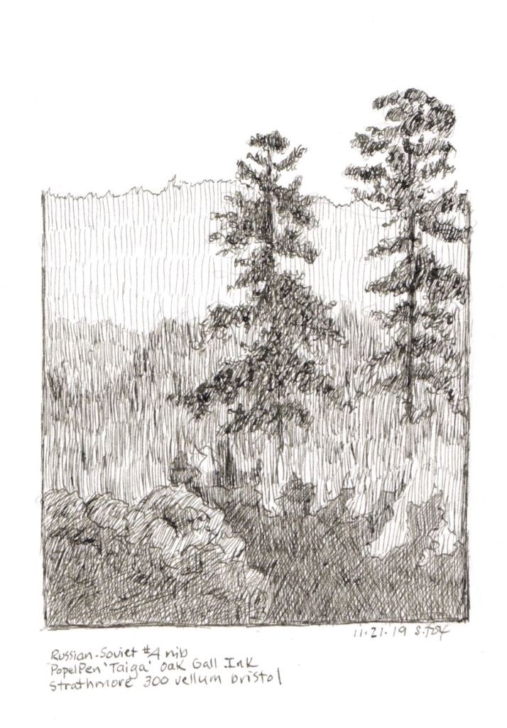
First I wanted to limit the variables, so went with one color to explore creating value relationships, using only “Taiga”, which at full strength out of the bottle is a warm very dark grey/almost black. (Ignore “oak gall” which is incorrect). The ink seems to dry pretty quickly, useful when needing to go over an area a number of times. It did blob a bit in the trees, but that could partly due to the nib I was using, one from the old Soviet Union, simply called #41, which I also purchased from the ink seller. It’s a small nib, fairly firm and makes a very consistent thin stroke, but it wasn’t happy covering the area quickly, so I’ll test it again on a slower, more deliberate sketch.

For the second sketch, I decided to explore what the various colors looked like together. This time I used an “official” art nib, the sought-after Esterbrook #355 Art&Drafting, which is fairly flexible and makes a fine line. The inks are “Coliseum”, the red; “Sahara”, the gold; and “Emerald”, the green. Once again I worked quickly. I can see lots of interesting possibilities and will be experimenting more, both in the studio and on location.
You can visit the Bukvawood shop here.

Hummingbird
Nice!
LikeLike
foxstudio
Thanks so much!
LikeLike