Charles Dana Gibson, the legendary late 19th century pen and ink artist, was an Influencer long before the term came into use to describe someone on social media who “influences” their followers’ tastes in clothes, food, music, where to go on vacation and other lifestyle choices. He drew all kinds of people, as you’ll see, but the young English and American society people who came out of his pen became iconic symbols of an ideal woman and man. And, to this day, people are aware of the “Gibson Girl”, that somewhat distant, dignified personification of an idealized type and a case of life literally imitating art since young women copied the hair styles, clothing and attitude they saw in Gibson’s illustrations.
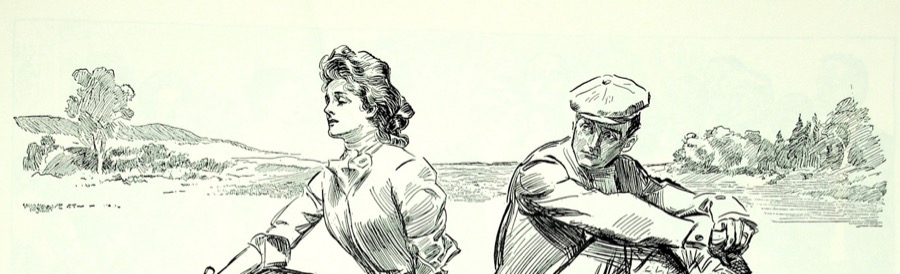
(The header image shows Gibson’s command of the human figure, landscape and control of value)

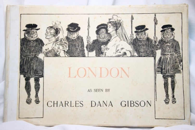
I had the good fortune many years ago to be able to purchase two of Gibson’s “coffee table” books, “London” and “The Education of Mr. Pip”. I’ve scanned a selection from both of them to share Gibson’s work and also explore what he can teach us about not only pen and ink drawing, but how to handle composition, value and creating character types.
We’ll start with an example of Gibson’s jawdropping facility with simply a pen, a bottle of ink and a piece of paper. Notice how fully realized the man is compared to how the dress of the woman is greatly simplified even though she is the figure closest to the viewer. The darkest darks form an interrupted band just behind their shoulders. All of the heads are almost, but not quite, in a line.

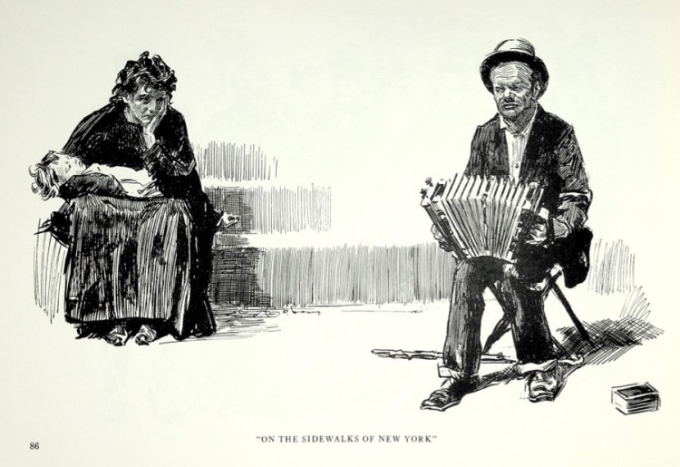
Gibson drew the other end of society too, those who struggled in the first Gilded Age simply to survive. Notice that while the man is in the foreground, the black of the woman’s shawl pulls the eye to her and then one sees the hopeless expression as she holds the sleeping child.
Technically, look at how Gibson indicated what are clearly steps of concrete or stone behind her. Simple vertical strokes with crosshatching for the shadows. To me this has the feeling of being drawn from life as the pen strokes are laid down very quickly.
Gibson also did portraits of his fellow artists, in this case George du Maurier, who is best know for writing and illustrating “Trilby”, the story of a young girl who becomes an artist’s model. This was clearly done from life and also very quickly. Gibson either used two or more nibs or one very flexible one, I suspect the latter, to lay in the dark coat and the lighter pants. What to me is really gutsy is how he effortlessly handles du Maurier’s face with simple, mostly vertical strokes and also varies the line weight of the hair with quick also vertical strokes.

In pen and ink work all one has is Line. Value, “Color” and form are all expressed in pen strokes of different lengths, widths and density. Every pen and ink artist has their own “line”, which is discussed in a number of the old pen and ink drawing instruction books I’ve been collecting and will be sharing in the future.
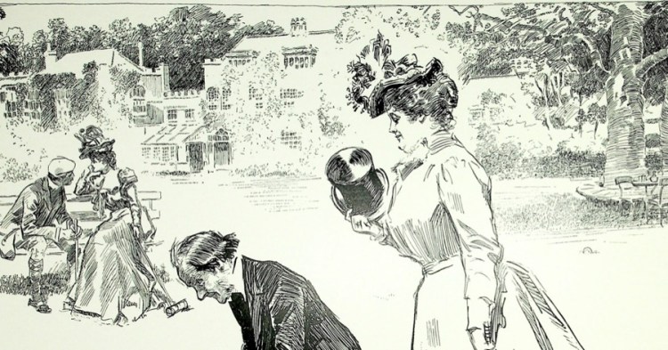
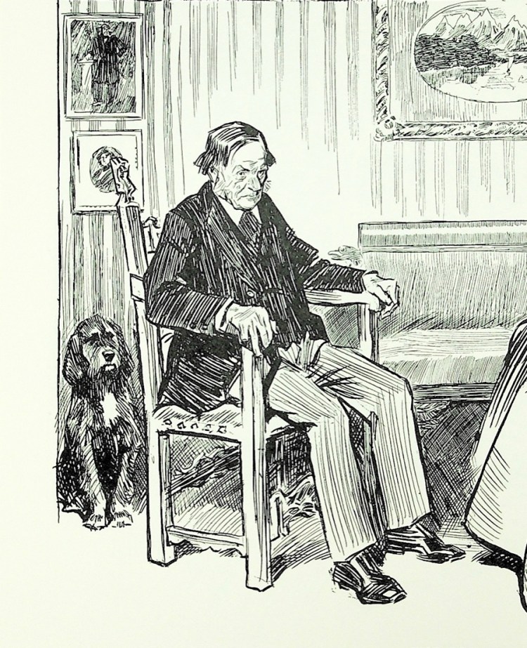
I chose this detail of a larger piece to demonstrate Gibson’s mastery of value and ability to draw anything equally well. Too many artists get caught up in “detail” as an absolute goal to always strive for, but visual interest and effectiveness of expression really comes from the selective use of it. Mr. Pip is the center of interest, the most completely rendered and also the overall darkest value. Lady Fitzmaurice is close behind with her head and hat. Mr. Pip’s daughter and her suiter have less value contrast and form one unit. Together, the angle of the foreground figures and the young couple form an asymmetrical “V” with Mr. Pip’s head. The tree on the right has nicely rendered light and shadow, though all lighter in value than the figures. The range of buildings, trees, shrubs and wall climbing plants across the back are simplified in the extreme, to the point of there being no lines around Lady Fitzmaurice’s head at all even though it’s in front of a tree. If the tree was fully rendered visual confusion would be the result.
Notice also that the ground is mostly left white, hardly a blade of grass to be seen except as the shadow under the tree and the bench.
The young couple are similar in value themselves and just a bit darker in value than the building and foliage behind them. The line of trees define the line of the building and also stop the eye from wandering off the drawing. It’s quite a nice composition all by itself. There’s also some very carefully designed negative space between Mr. Pip’s profile and the croquet racket.

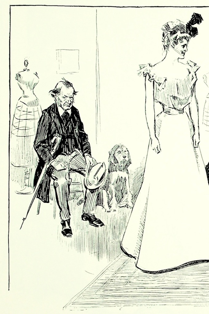
While Gibson was known for his people, he also included animals on occasion who have just as much character and individuality. They are the silent observers of the humans’ shenanigans.
One of the things we were taught when I was studying illustration was to be specific, not generic. This is a real dog who belongs to someone and is drawn from life, at least for preliminary sketches. And he makes two appearances in Mr. Pip’s story. Notice how the front legs are in a different position in each drawing and how, through the use of value, the dog is fully in the first picture and part of the background in the second. He looks to be some kind of spaniel or spaniel mix with those long ears. Maybe he was the canine companion of one of Gibson’s artist friends.
It’s interesting to note the similarities between the two drawings of Mr Pip, essentially variations on a theme.
Cats show up also and like the dog are all individuals.
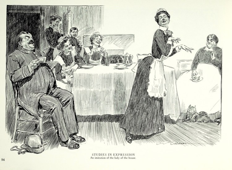
In this case the cat is joining in the amusement of the maid’s imitation of her mistress, wonderfully rendered in quick, sure strokes, no fussing.

One could imagine Gibson taking a few minutes to slip into the kitchen or servant’s areas to do some quick pencil sketches on a scrap of paper of the resident cats.
And here we have a cat and a dog, clearly allied with their respective humans. They are clearly “breeds” intended as companions for well-off folk.
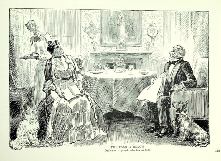
Both books came out in the late 1890s, so this is a nice look at the pets people kept back then and what they looked like. The cat resembles today’s persians and the dog is a terrier, perhaps a version of the Scottish terrier.
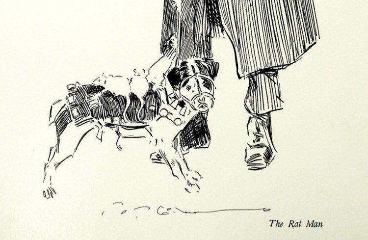
Back onto the streets and another terrier, one with a job.

Imagine being able to get the local ratcatcher and his dog to pose for you with the results of their work? What a wonderful drawing!
Finally, a Gibson horse, also almost certainly sketched from life with pen and ink.

This was done FAST, no dinking and dunking. It requires solid knowledge of the anatomy of the animal to do this and mess it up since there is no erasing.

Final notes: the books I’ve used as my image source were originally published in New York by R.H. Russell, 1899. They are 12 3/4″ x 17.5″.
Charles Dana Gibson was born in 1867 and died in 1944. His wife, Irene Langhorne, and her four sisters served as inspiration for him. One, Nancy Astor, became the first woman to serve in the House of Commons. While he is best known for the “Gibson Girl” Gibson had a long career that included buying and running LIFE magazine for a number of years. Towards the end of his life he stopped doing commercial work and painted for pleasure.

Leave a comment