
William Heath Robinson was one of the most popular and beloved illustrator/artists of late 19th and early 20th century England. He was also a master of pen and ink. He first became known as a book illustrator and I’m posting examples of that from a two-volume set of “The Works of Rabalais” from my own collection. (I’ve scanned a selection of them with my Czur book scanner, which lets me lay the books flat and upright so there’s no risk of damaging the spine. The tradeoff is that it has trouble seeing off-white paper correctly. I’m going to be in touch with the company to see if they can fine-tune the software for artists because it’s really a perfect solution for our scanning needs).
What made him famous and still-remembered, however, were his drawings of “machines”, things built to solve a problem in the most convoluted and complex way possible. They became known as “Heath Robinsons” and the term is still in use today (I heard someone use it on a Brit show we were watching not long ago). Better known here is an American artist who also invented his own crazy gadgets, and is also known by his name, Rube Goldberg. Here’s one example from Robinson of a machine to test golf drivers:

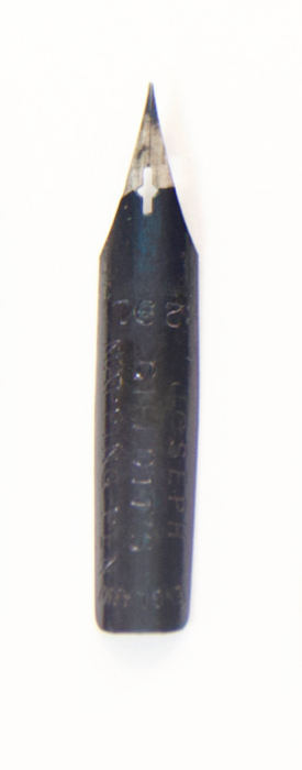
But Robinson’s skills went way beyond cartoon gadgets. He was truly a master of pen and ink. During my researches I’ve been able to discover what nibs some well-known artists used. Robinson liked the Gillott 291, which was one of the most popular nibs for artists. I’ve have a good supply of them and have done some work using them. They’re terrific.
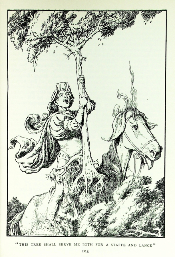
At the top and above are two examples of how Robinson drew horses, foliage, trees, drapery and people. He was a master of line, which is all one has when using a pen, and value, the pattern of light and dark.
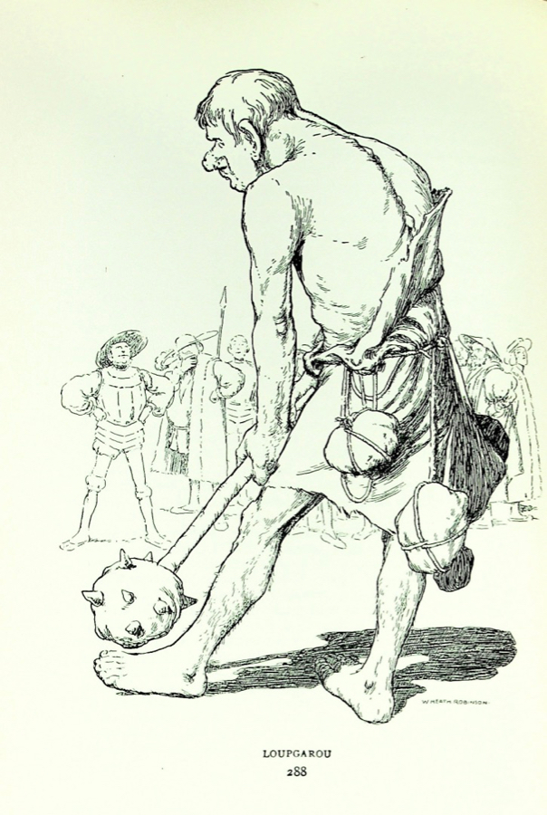
Here he uses essentially two line values to create a foreground and background. Notice also how simply he models the body of the giant, yet the muscle definition is quite clear. In pen and ink every line counts and Robinson clearly had a great command of anatomy.
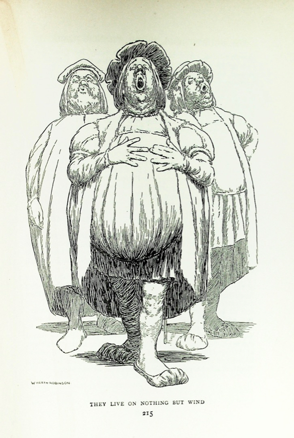
Another example of value contrast to create space. Observe that the figures in the background are largely reduced to simple shapes and simple pen work. The main figure demonstrates how to use pen and ink to create volume (that stomach!) and the illusion of three dimensions.
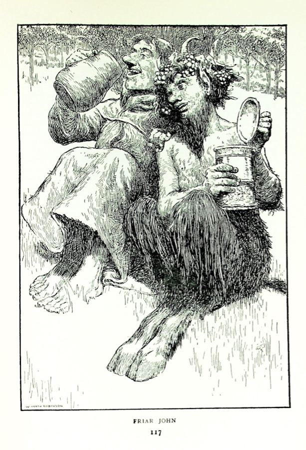
Sometimes he went for far more detail and texture. There’s a lot of variety in the drawings in these two volumes, everything from a simple vignetted head to fully realized scenes. He used short straight strokes for the friar’s robe and long, sweeping strokes for the upper legs of the satyr. The forest in the background makes the friar’s head “pop”. The grass is indicated by relatively few straight lines of different lengths. He used short straight lines to model the jug even though the jug is clearly curved.

The simplicity of the head above is not easy to do. The “secret” is that these artists worked out not only the drawing and values before starting but also the pattern of the pen strokes as well. If you are interested in taking up dip pens and ink or are already using them you might find it rewarding to do a copy of this head and maybe all or parts of some of the other pieces.
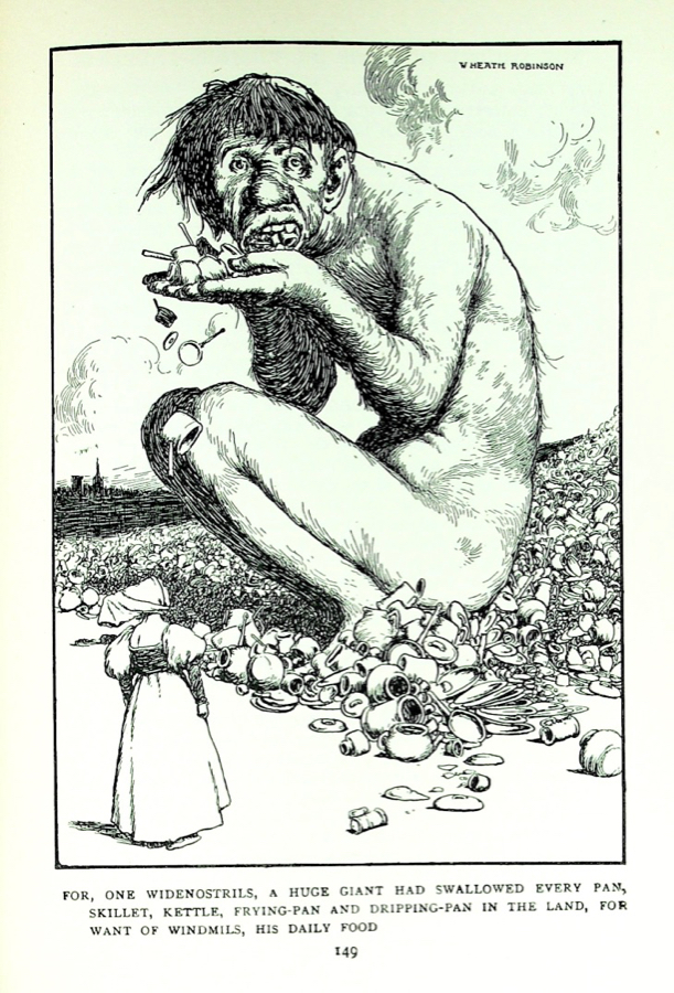
Look how few lines he used to indicate the clouds. Not one line more than is needed. He uses the same pattern of marks on the body of the giant, which visually helps pull the piece together. The woman is drawn very simply, essentially an outline except for the bodice and sleeves of her dress, so she becomes part of the rest of the scene with her head picked out by the darker shadow area behind her.
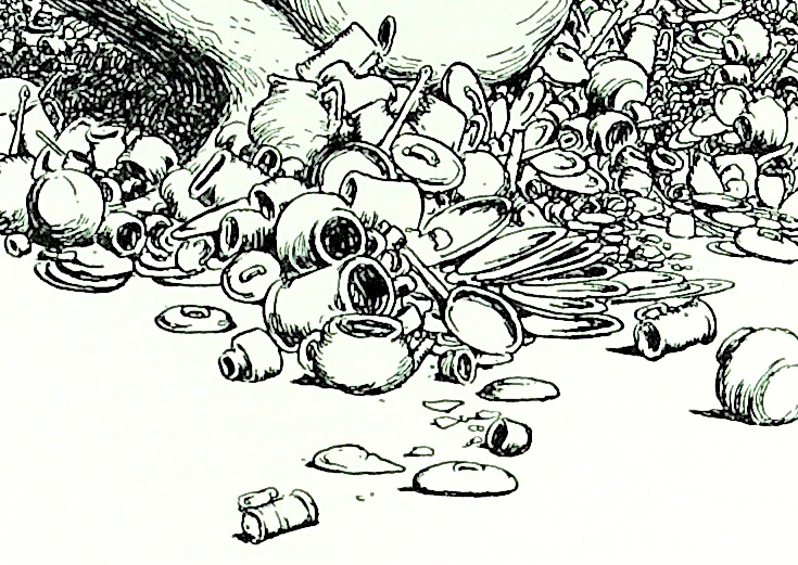
I just had to crop in on the dishes and share them because they are absolutely delightful all by themselves, a great little composition.
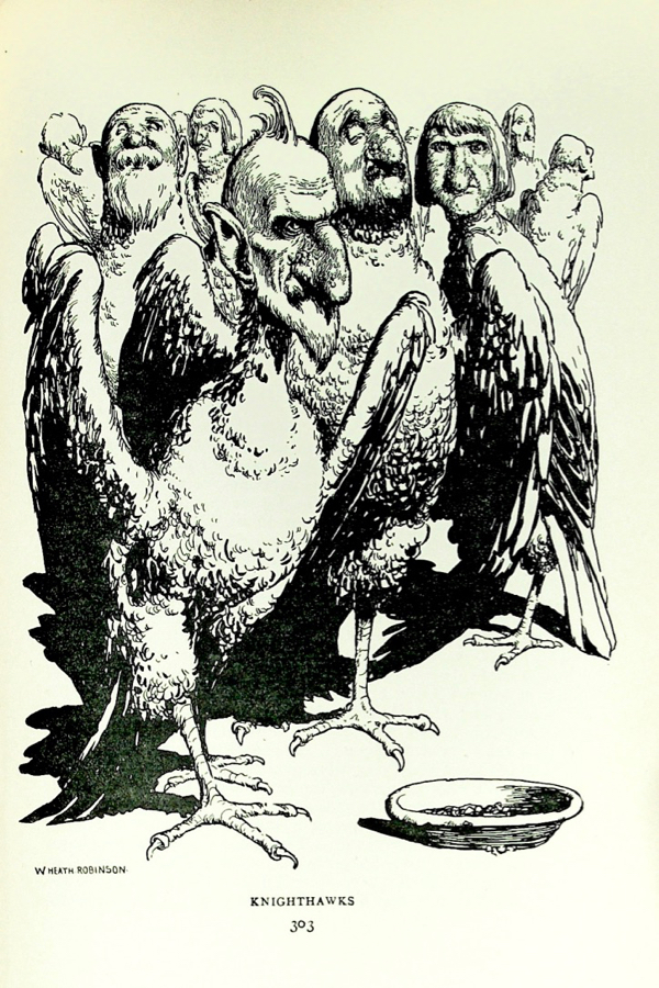
And finally, in a few of the drawings he wanted his blacks to be Really Black so he used a brush and ink. It’s most evident in the wing of the right hand figure.
I hope you’ve found this introduction to William Heath Robinson to be interesting and informative. If you have any questions, please ask in the comments!

Leave a comment