What’s Your Line? Line Quality In Pen & Ink Drawing (Traditional)
Charles Dana Gibson was renowned in his time (late 19th/early 20th centuries) for his instantly recognizable style, almost a rock star, best known for his “Gibson Girl”. He doesn’t appear to have ever written much, if anything, about his materials and technique, but one can tell by the strokes that he could work very, very quickly with great confidence
Back in the late 19th into almost the middle of the 20th century a dip pen and ink on paper was the standard media for black and white illustration. Every magazine at the time depended on the skill of those artists to bring alive various articles and also many advertisments. Companies needed them for illustrating their products. Many of the artists became famous in their own right. In this post I’ll be showing you a variety of pen and ink pieces with distinctive line styles. You can use them as an exercise to try some or all of them out. From my research, which I’ll be sharing in a future post, when I’ve been able to find out the brand of nib an artist used, they almost all used one of three….Gillott, a British company and Esterbrook or Hunt, both American, plus a small variety of other, lesser known, ones.
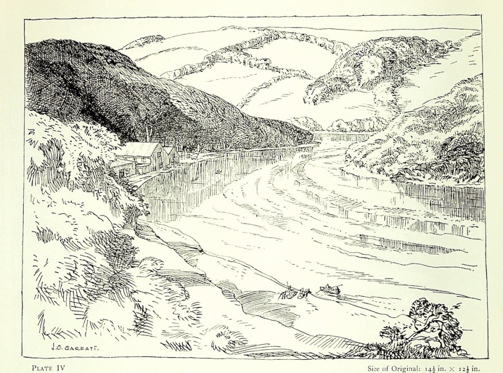
Frank Brangwyn, was a famous and much respected English artist who was equally excellent in drawing, painting, printmaking and pen and ink. This is one of his location sketches. He was clearly working very quickly, just putting down his impression of the scene, knowing that the people could move at any moment.J. Geoffrey Garratt seems to have been largely forgotten now and there is very little information about his life and work. But he did write an excellent book “Landscape Drawing in Pen and Ink”, published in 1950. It’s a slim but wonderful book filled with good information and lots of his pen and ink art. He seems to have worked entirely on location and, as you can see from this sample, used a wide variety of marks and strokes. Look particularly at how he handled the water in the river, using simple parallel lines to indicate reflections.Rockwell Kent is best known for his paintings of highly stylized landscapes and he brought this same interpretive sensibility to his pen and ink work. Notice the variety of lines he used to indicate form in this drawing of a mountain.
William Heath Robinson had a dazzling career as an artist/illustrator in the late 19th, early 20th centuries which coincided with what could be called The Golden Age of pen and ink art. This a good example of both how line can be used to define form and also how line thicknesses can create different values of light and dark.
One can buy Gillott and Hunt nibs today, but be aware that they are now totally manufactured by machines whereas the vintage ones were manufactured by mostly women using hand-operated equipment for every step in the eight-step process. The steel was different also and different “recipes” were used for different nibs. All to say the new ones are just fine and are readily and easily available, but the vintage ones are special and worth hunting for. I sell sets of vintage nibs for artists at my Fox Studio Etsy shop. I’ve used every “model” of artist’s nib myself for both drawing and sketching. They range from fairly stiff and sturdy, like a family sedan, to very flexible and touchy, like a high end sports car.


Leave a comment